UX CASE STUDY
Golden: A Recreation App Designed for Seniors
DURATION: 10 WEEKS
ROLE: UX/UI, BRANDING
TOOLS: SKETCH, INVISION
Introduction
Golden is an app designed to address chronic loneliness in senior adults by connecting them with social, accessible recreation opportunities. I designed this app as my capstone project for the BrainStation UX Diploma Program.
Social isolation is detrimental to the health and well-being of seniors, who make up an ever-increasing proportion of the Canadian population. This has widespread social and economic repercussions.
With a background in disability research communications, I knew that I was interested in addressing health and well-being. Additionally, I have a more holistic definition of what makes a person “well” that includes social participation. With any luck, most of us will grow old and experience the gradual decline in abilities that is a key contributing factor to senior isolation. This is a universal problem with surprisingly few digital interventions, and I wanted to see what I could do .
Research
This project started with a literature review in order to better understand both the problem of chronic loneliness as well as how seniors are currently using technology.
KEY INSIGHTS
- More than 40% of aged 65+ report feeling chronically lonely.
- Chronic loneliness is correlated to a large list of health concerns including cardiovascular disease, stroke, high blood pressure, cognitive decline, dementia and premature death.
- Although seniors report lower rates of technology use than younger user groups, they are now the fastest-growing tech users in wealthier countries like Canada and the US.
- Four out of ten seniors own a smartphone, and three in ten own a tablet.
- Senior users are more likely to give up and blame themselves when they encounter a problem rather than troubleshoot.
Interviews
I interviewed seniors ranging from age 65-95, as well as a family caretaker who helps facilitate social activities for an elderly parent. I asked them about their (or their parent’s) social lives today vs. 20 years ago, how they felt about their current level of social connection, and details about their technology use.
KEY INSIGHTS
- All interviewees (and the family caretaker in regards to her mother) find it more difficult to stay socially engaged as they grow older, due to changing health status and shifting social networks.
- Interviewees currently find out about recreation or social opportunities by paper channels (newsletters and notices in community centres, senior facilities, etc) or phone calls from friends and family members.
- Having a social coordinator available to plan activities is viewed as a large benefit to living in a senior facility, even when seniors would prefer to live independently.
- Embarrassment is a large barrier to learning new technologies, as interviewees tend to blame themselves for errors rather than the product itself.
- When interviewees run into trouble when using technology, they are likely to turn the product off rather than try to solve it.
- Family caretakers are often older adults themselves (ie “younger seniors”) and may be less confident with technology than younger generations.
User Personas
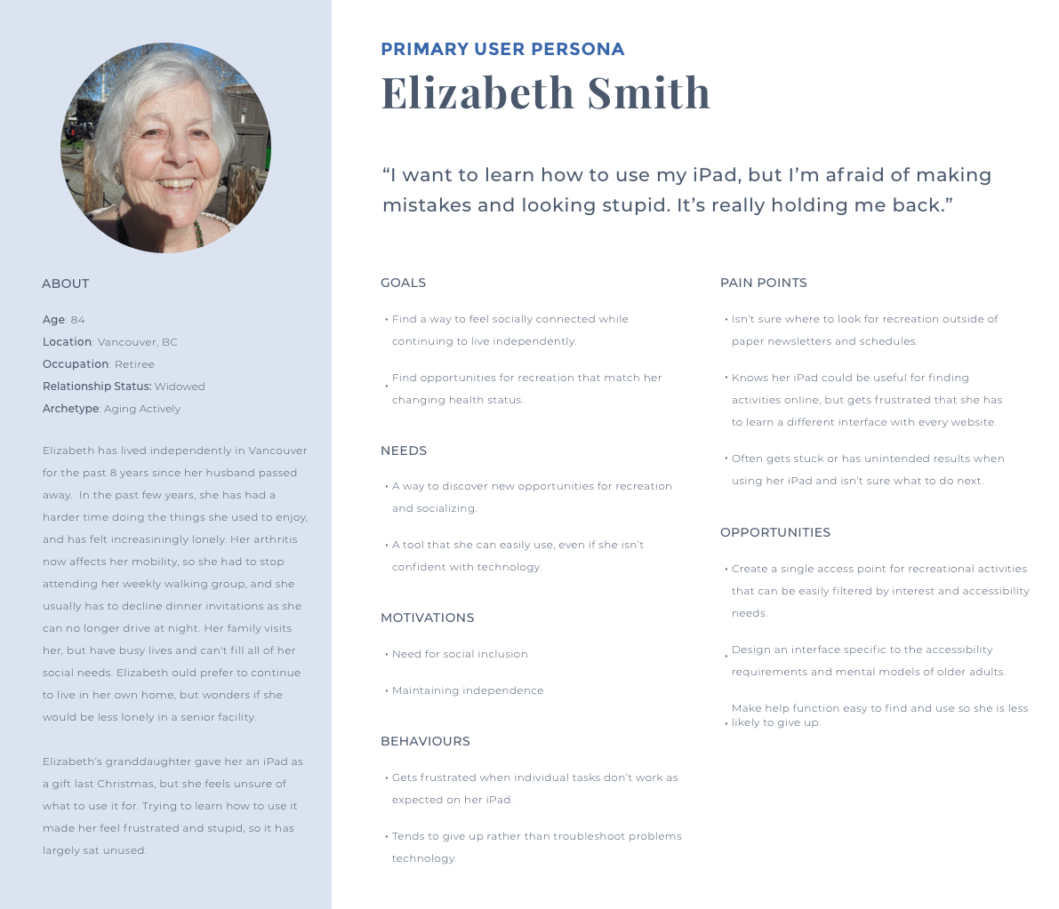
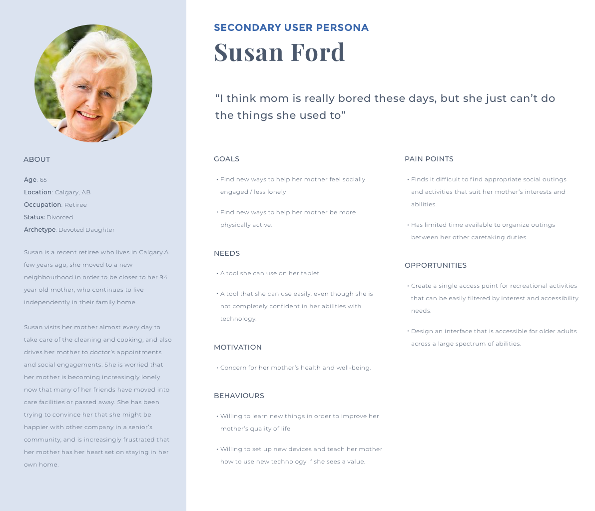
Using insights from the above research and interviews, I developed two user personas to represent the experiences of my targeted users.
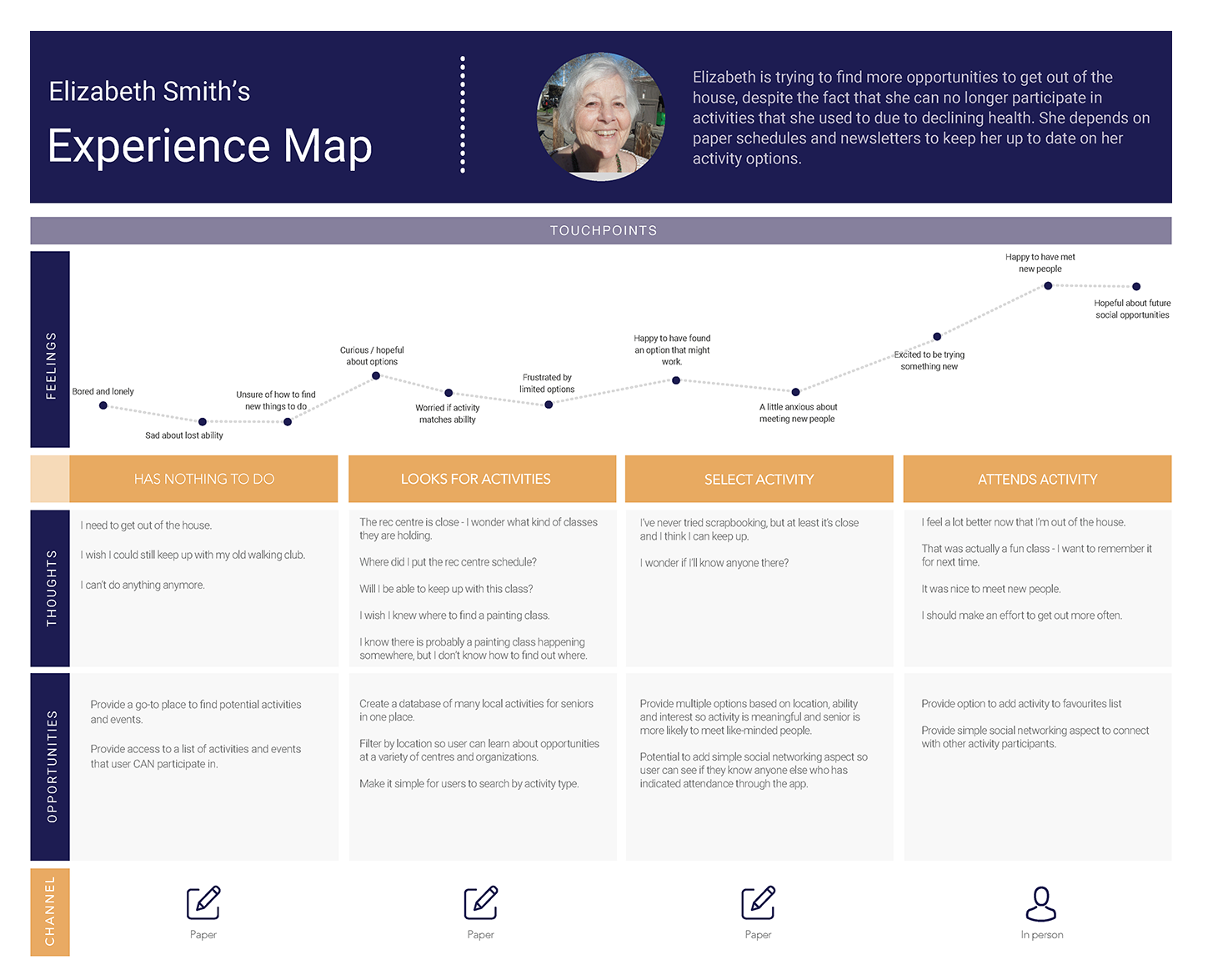
Journey Map
As a next step, I created a journey map to illustrate how people like Elizabeth currently search for recreation and social activities. The primary takeaway from this activity, which was based on earlier research and interviews, is that paper is the main touchpoint with each step. The majority of seniors learn about upcoming activities and social events through paper newsletters and posters, or the rare e-newsletter. Since these only list opportunities at a single organization, seniors are missing out on learning about anything going on outside of that venue. .
Design Challenge
Based on the above research, I established the following design challenge:
How might we reduce chronic loneliness for seniors with a digital solution for finding social activities that older adults will want, and be able, to use?
Wireframes: 1st Iteration
I quickly learned that designing for seniors is a bit of a wild west situation- there aren’t many successful examples to draw from and very few established rules to follow. My first attempt felt so far off base that a light sense of panic started to set in as I watched my testers struggle their way through my wireframes.
USER TESTING: KEY INSIGHTS
- A primary assumption was that finding the right activity would be more important to seniors than the particular day it fell on, since they were retired and (I assumed) had flexible schedules. My senior users were not at all impressed with this – it turns out that seniors have schedules that they like to stick to.
- Users found the tab navigation confusing. If they had ever used an iPad, they expected a standard iPad navigation bar at the bottom.
- The “Favourites” tab was also a point of confusion, mainly the difference between “Add to Favourites” and “Add to Calendar”.
- Users were overwhelmed by the amount of information on each page.
- Lastly, users were confused by the filters on the results page and did not know they were clickable.
Back to the drawing board…
Wireframes:
2nd Iteration
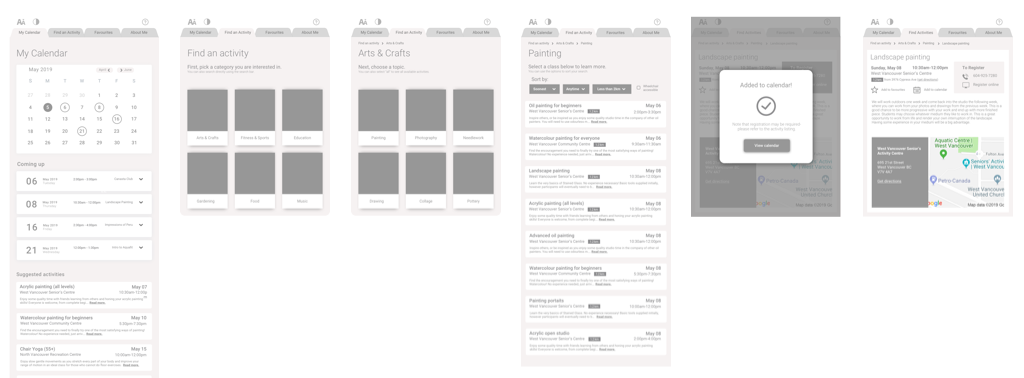
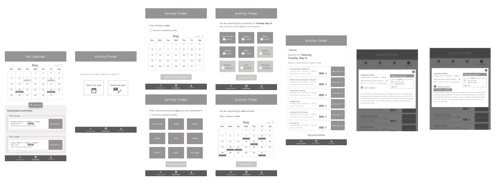
My second iteration involved a major overhaul to address the issues uncovered during user testing.
RESPONSE TO USER TESTING
- I addressed user frustration with being unable to search for activities on a specific date by allowing users to start with either a date or an activity type. Users will be lead through two different flows, depending on how they choose to start their search.
- I designed the navigation to match the standard iPad navigation bar
- The “Favourites” tab to address user confusion over it’s purpose
- The map section was removed from the Details screen to reduce clutter.
- Overall, information was restructured and simplified.
Testing with this iteration was much more successful, although I still had work to do.
A high fidelity version was next, including the addition of branding colours. I also developed an interactive prototype using InVision.
Branding
NAME
I chose the name “Golden” to play off the idea of “golden years”. I wanted something upbeat yet classic, that would appeal to users aged 65+. I explored the possibility of dropping the “e” (“goldn”), but senior users were perplexed by the misspelling.
COLOURS
High contrast shades of blue were selected for their universal appeal – people of both genders respond positively to blue. As well, the colours perform well even with the colour vision loss that becomes more common as we age (although it’s important to note that our ability to differentiate between shades of blue declines with age, so different shades should not be used to imply meaning). A golden yellow compliments the blue, but is only used where high contrast is not required. All text and blue elements pass AAA accessibility standards.

WORDMARK
I tried a few different serif typefaces and settled on “Playfair Display” for it’s modern, yet classic appeal.

ICONS
I designed simple icons in a limited colour palette to help reduce cognitive load.
Marketing Website
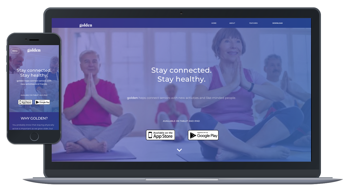
I developed a responsive marketing website prototype to advertise the benefits of using Golden. Since so few seniors are on the web (and many report receiving assistance from younger people in setting up their devices and accounts), my primary audience for this site is family members, service providers and recreation facility staff who would then direct seniors to Golden and help them set it up
Impact
I really believe in the potential benefits of an app like Golden, and plan to continue to test and develop my design. I picked a challenging problem space and I look forward to learning so much more.
Only good things can happen if more designers start paying attention to older user groups. I believe this is inevitable – the first of the millennial generation will turn 40 this year, and will naturally turn to technology as a way to help them stay happier and healthier as they tackle middle age and beyond. Social networking will be an obvious means for them to stay socially connected, and this is an avenue I’m interested in exploring for Golden. Can I make meeting people online more appealing to current seniors? Is there a way to make it fit within their mental models of “friendship”? Additionally, I’m interested in the possibility of adding functionality for user-organized activities – similar to Meetup – in future iterations.
With such an untapped market, there is a lot to explore here!

