
UX CASE STUDY
Health Information Research Unit (HIRU)
DURATION: 8 WEEKS
(IN DEVELOPMENT)
ROLE: UX/UI, INFORMATION ARCHITECTURE, BRANDING, DEVELOPMENT
TOOLS: FIGMA, ILLUSTRATOR
TL;DR (Demo)
Background
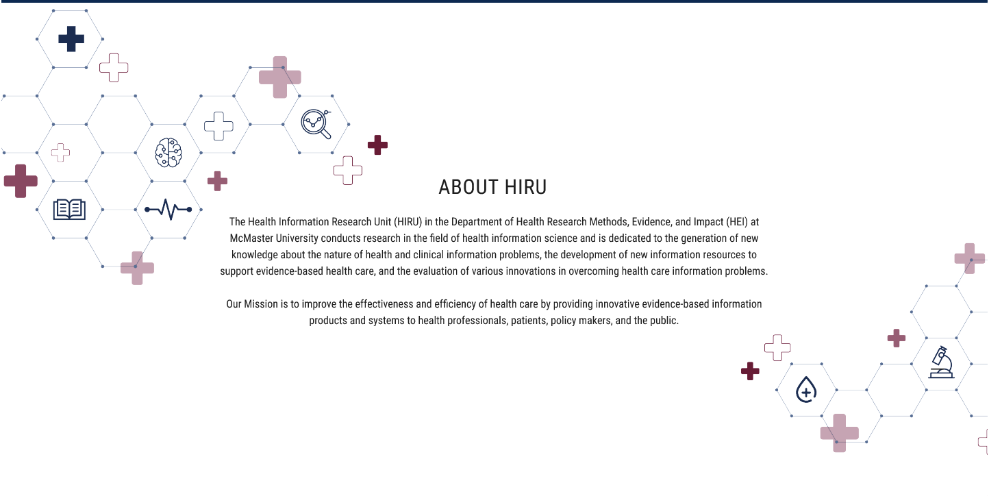
The Health Information Research Unit (HIRU) is a multidisciplinary group of scientists at McMaster University working to improve healthcare outcomes by improving access to quality research information.
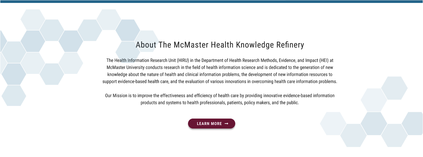
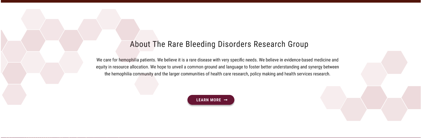
Within HIRU falls two very different research “arms”, the Health Knowledge Refinery and the Rare Bleeding Disorders Research Group. Both are under the leadership of a single director and need to be housed under the umbrella of HIRU.
HIRU is funded by McMaster University, which has its own branding guidelines and design system. The client did not want a website that looked like a “McMaster” site (and academics sometimes switch institutions, bringing their research with them), but conversations with McMaster stakeholders indicated that future restrictions on “off-brand” websites were possible.
Interviews
I created a Typeform survey to distribute to stakeholders involved in different areas of HIRU, including researchers, administrative staff and patients. I received 11 responses to 15 invitations.
Sample questions included:
- Who they think is the primary audience of the website
- How often they use the existing website
- What tasks they perform when using the existing website
- What tasks they wish they could perform
- Examples of other websites they use for similar tasks and what they like or dislike about them
- Examples of any other websites they use frequently and what they like or dislike about them
KEY INSIGHTS
- 80% of respondents did not use the existing website at all because they did know where to find useable information.
“The website in information-packed, however, as you go from one page to the other the site looks like it has grown organically without a greater vision (or cohesion).”
- Users who did frequent the site had memorized the path to particular content, even if it didn’t make sense to them.
- Users were reluctant to share the existing website link as they did not think the recipient would be able to find relevant information.
- While respondents thought that other researchers and students were the existing primary audience, most hoped that the new website would appeal to healthcare professionals and (potentially lucrative) pharmaceutical partners.
- The Health Knowledge Refinery was seen as the priority “arm” of research
- Users preferred clean, modern websites… the exact opposite of what is frequently found in the academic world.
“HiRU is a medicine research information site. I think it could be a lot more interesting, but shouldn’t be flashy! Medicine is serious business.”
User Personas
I created two user personas informed by survey responses and additional conversations with my contacts at HIRU, and shared them for feedback. This helped me really understand their target audience and also to wrap my head around the type of work conducted at HIRU, since it’s complex and outside of my own experience.
")
-1")
Primary challenge
Present both research “arms” under the common umbrella of HIRU, where very diverse visitors with varying knowledge of HIRU can easily find their area of interest.
Design strategy
Concentrate on navigation that allows both community “insiders” and “outsiders” to find what they are looking for. Call out products and services using plain language aimed at new users exploring the site. Use tabbed content to prevent visitors from become overwhelmed by the large number of options.
Unite the different areas of the website through repetition of common elements to maintain a cohesive experience, with unique colours assigned to the different research “arms” to help users understand where they are.
The HIRU “hive”
Members spoke of HIRU as a busy group of individuals working towards a common goal. Their research interests and activities might be diverse, but everyone shares a singular vision of improving healthcare outcomes. This made me think of a “hive” or “honeycomb” motif that ties the different areas of the HIRU site together.
Secondary challenge
Create a unique look and feel for HIRU, maintain portability (should the Director switch institutions down the road)… and insure against the need for a total redesign if the organization restricts “off brand” websites in the future.
Design strategy
Base elements, layouts and fonts on the established McMaster design system for future flexibility – if brand compliance tightens in the future, a few tweaks to the style sheet will make it 100% compliant. At the same time, different CSS tweaks would remove all traces of McMaster if the unit moves institutions.
Navigation
Navigation Prototypes
WIREFRAME SKETCH

LOW FIDELITY
HIGH FIDELITY
MOBILE
Result
The best feedback received from the team at HIRU was that seeing how I had structured their website helped them clarify how they think about their organization and how projects relate to each other. The new design was approved and is now under development.
The “hive” concept was very well received and further adopted in other branded assets.