UX CASE STUDY
Sepsis Canada: Community-Led Branding
DURATION: 3 WEEKS
ROLE: BRANDING
TOOLS: ILLUSTRATOR, INDESIGN, TYPEFORM
Background
Sepsis Canada is a national Network of Centres of Excellence with the aim of reducing the burden of sepsis (the leading cause of death among COVID-19 patients) on the Canadian healthcare system.
I worked with stakeholders from the sepsis community, including survivors, healthcare workers, and researchers, to establish a logo, colour palette and visual branding guide.
Process
I created a survey that received six responses sepsis survivors, researchers, and healthcare workers.
Example questions included:
- What images or symbols come to mind when you hear the Sepsis Canada vision to “Suspect sepsis, save lives and support recovery”? Why?
- What colours come to mind? Why?
- Do you have any colours that you would not want to see in a Sepsis Canada logo?
- Can you share any favourite brands or logos? What you like about them?
- Do you have anything else you think I should know as I create a logo and visual identity for Sepsis Canada?
I also conducted three brief interviews where I asked similar questions but had more opportunity to dive into the hows and the whys.
Not surprisingly, I received a wide variety of answers! However, the importance of emphasizing that this is a Canadian network came up frequently. As well, it was mentioned several times that the colours red and black are the official colours of sepsis awareness and that we should not try to reinvent the wheel.
Result
Ultimately, I settled on shades of red and blue-grey, representing both the official colours of Canada (red) and sepsis awareness (red and black). I used a maple leaf as the primary icon, with a curved “s” shaped stem for “sepsis”. After testing several versions on members and collecting feedback, a new graphical mark was finalized to represent the network:
![]()
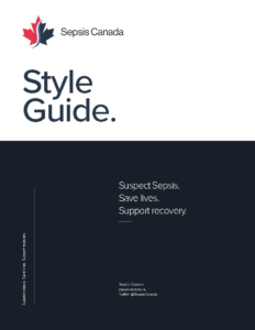
From there, I created a range of logo variations and a comprehensive style guide to help guide the overall visual identity of the network.
Feedback from stakeholder meetings was extremely positive and the logo and style guide was incorporated in the development of a new website and all visual assets.

